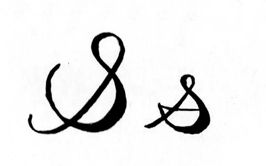
The cursive s challenges many writers in unique ways. This elegant letter feels like an entirely new writing system compared to its printed version. A distinctive hook extends to the left in the uppercase cursive S. The lowercase cursive s takes the shape of a small sail, and both forms often puzzle beginners.
Writers need to grasp both capital and lowercase cursive s to develop speed and fluency in their handwriting. Cursive writing evolved as a faster alternative to print, allowing letters to flow smoothly into each other. This complete guide explores the foundations of the letter s in cursive. Simple strokes transform into elegant variations that help writers at every skill level craft this challenging yet beautiful letter with confidence and style.
Table of Contents
Understanding the Basics of the Letter S in Cursive
The cursive letter S shows how handwriting styles are different in structure and execution. Cursive writing is different from print handwriting because the letters connect and flow together. This connection makes writing quicker and more natural.
What makes cursive S different from print
The main difference between cursive and print S lies in how we form and connect them. Print S exists as a standalone letter with clear stops and starts. The cursive S naturally flows into the next letter, which creates one continuous line instead of separate characters.
The uppercase cursive S (capital S) has a unique trait – it ends in the middle, so it can’t connect to the next letter. This makes it unlike most other capital letters in cursive. The lowercase cursive s uses curved lines that blend with following letters, which creates smooth word transitions.
Modern cursive S appears in the D’Nealian® style, while the Zaner-Bloser® style shows a more traditional, decorative form. These styles show how cursive has changed over time, and each one interprets the letter in its own way.
The slant of cursive letters should stay consistent throughout your writing. This creates a harmonious look that’s nowhere near the vertical alignment you see in print letters.
The way we form these letters shows clear differences:
- The cursive lowercase “s” starts at the baseline with a small right-facing loop, curves down and left, and ends with a slight upward flick
- The cursive uppercase “S” begins just above the baseline and creates a large loop that curves left then right
- Print S usually starts at the top and follows an S-shaped path without connecting to other letters
Why cursive S is often confusing for beginners
The cursive S ranks among the simpler letters to learn (especially lowercase), but new writers face several challenges. Students often get confused because the letter looks different depending on its position. The shape of a cursive s changes based on the letter that comes before it – an “o” before the s creates a different look than other letters.
The lowercase cursive s belongs with the “Kite String” letters: i, u, w, t, j, p, r, and o. This grouping helps new writers understand the basic stroke pattern, but they need to remember which letters go together.
The technical steps to write a cursive s can overwhelm beginners. The instructions read: “Start at the writing line, make a kite string to the middle divider. Go straight down to the writing line and make a big fat belly (at 5 o’clock). Continue the fat belly until 7 o’clock and join it with the kite string. Retrace from 7 o’clock to 5 o’clock and continue for release stroke”.
Learning cursive S has its rewards. Research shows that more than 70% of letters have different shapes and strokes in cursive versus print. Students who master these differences develop better fine motor skills because connected letters create smoother strokes.
The uppercase S joins only three other uppercase cursive letters (I, J, and G) that start on the line. This makes it a key letter to learn for proper cursive writing.
How to Write a Capital S in Cursive
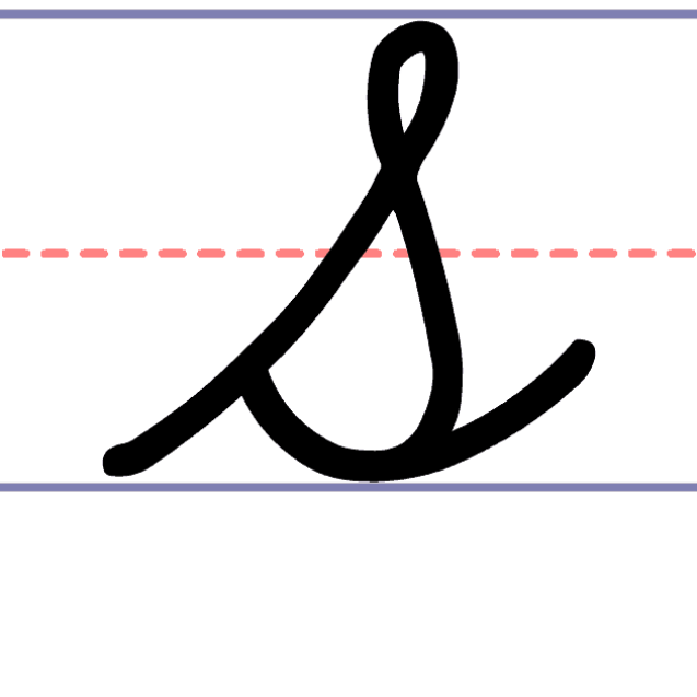
The uppercase cursive S stands out in the cursive alphabet with its elegant yet simple design. You’ll need to understand its unique formation and practice proper technique to write it well.
Step-by-step guide to uppercase cursive S
The capital S flows in a pattern that creates beautiful loops and curves. Here’s how you can form it:
- Position your pen at the baseline (bottom line of your paper)
- Create an upward stroke that curves slightly to the right
- Form the top loop by sweeping around in a gentle curve that touches the top line
- Cross back over your original stroke in the middle of the letter
- Continue downward in a smooth, broader curve to form the bottom loop
- Finish with a hook or slight upward curve at the bottom right
This method creates an elegant capital S that looks like a graceful figure-8 with a hook at the end. Many teachers tell students to picture a snake lifting its head from a coiled position to help them visualize the shape.
The letter needs precise and proportional top and bottom loops to look balanced. The bottom loop should mirror the top one but appear slightly larger, giving the S its distinctive shape.
Common mistakes to avoid
The capital cursive S can challenge even skilled writers. Here are some pitfalls to watch for:
The middle crossing point matters a lot. Crossing too high or too low will throw off the letter’s look. Your crossing point should hit right at the middle line for the best proportion.
Uneven loop sizes can make your S look awkward. Both loops need similar curves, though the bottom one should be a bit larger.
Many new writers lift their pen while making the letter. Note that cursive letters should flow in one continuous stroke.
Quick writing often leads to messy results. You need to find the right speed – not too fast and not too slow – to create fluid, graceful letters.
Tips for smooth transitions to the next letter
The capital S is unique because it usually doesn’t connect to the following letter. You’ll typically lift your pen after finishing the S before starting the next letter.
Some cursive styles do let you connect the S to other letters. These styles use natural linking strokes from the S to the next letter’s starting point.
Words flow better when your letters slant consistently. A slight paper rotation helps create that right-leaning slant that makes cursive look elegant.
Practice makes perfect with the capital S. Focus on fluid motions and balanced loops. Soon you’ll write this beautiful letter naturally, adding grace to your cursive writing.
Mastering the Lowercase Cursive S
The lowercase cursive ‘s’ combines both simplicity and elegance once you master it properly. Many beginners find it challenging to form and connect this letter precisely, even though it’s among the easier ones to learn. Let’s look at ways to perfect this vital letter in your cursive writing.
How to form the cursive s lowercase
The lowercase cursive ‘s’ is part of the “Kite String” group of letters that has i, u, w, t, j, p, r, o. This grouping helps you understand its simple stroke pattern. Here’s how to form this letter correctly:
- Start just below the middle line
- Make a small, upward curve to the middle line
- Loop back down to the left, crossing your original stroke
- Curve around to the right, forming a small loop below the middle line
- Continue downward to the bottom line with a slight curve to the left
- Finish with a small upward stroke that extends just above the bottom line
Teachers often guide their students with verbal prompts: “Start at the writing line, make a kite string to the middle divider. Point straight down to the writing line and make a big fat belly (at 5 o’clock). Continue the fat belly until 7 o’clock and join it with the kite string. Retrace from 7 o’clock to 5 o’clock and continue for release stroke”.
How it connects to other letters
The letter’s upward curve below the middle line naturally flows into the next letter. This connection point plays a vital role in fluid handwriting.
Some handwriting styles suggest that the ‘s’ usually stands alone, though connecting it remains possible. Multiple s’s combine easily—you simply go up to begin the next ‘s’, curve around, and continue the pattern.
The exit stroke must adapt based on the following letter. Connecting ‘s’ to letters like a, c, or e needs a different approach than linking to taller letters like b, d, or h. Your connecting stroke should flow naturally and maintain your writing rhythm.
Practice drills for better flow
These effective techniques will help you master the lowercase cursive ‘s’:
- Repetition exercises – Write rows of connected s’s to build muscle memory
- Multi-sensory approaches – Form the letter in shaving cream, rice, sand, or with Play Dough
- Whole-body movements – Make the letter with your entire body before scaling down to paper
- Finding your speed – Your ideal writing pace—not too fast, not too slow—makes cursive look better at a fairly quick tempo
Short words beginning with ‘s’ (like swim, stop, shoe, slip) help build confidence in letter connections. These real-life examples let you apply your skills practically.
Note that a relaxed hand prevents a tense grip that leads to shaky cursive. The right paper rotation helps achieve the consistent right-leaning slant that makes cursive writing beautiful.
Adding Style: Variations and Fancy Cursive S
The cursive S goes beyond simple forms and opens up countless ways to express creativity and add personal touches. You can explore this versatile letter’s artistic potential in both uppercase and lowercase forms once you become skilled at the fundamental strokes.
How to personalize your cursive S
Your journey to personalize the cursive S starts with a simple truth: you have plenty of room for self-expression while keeping the basic form recognizable. A calligraphy expert puts it well: “as long as the basic form is there, people will be able to read your writing.” This gives you the freedom to develop your signature style that stays readable yet unique.
Try these creative approaches:
- Varying the size and proportion of loops
- Adjusting the slant angle slightly
- Modifying the entry and exit strokes
- Changing the thickness of certain parts of the letter
The cursive style works best with quick, simplified movements. Your pen should stay on the paper while forming your cursive S to keep that smooth motion that makes cursive writing special.
Examples of elegant and calligraphy-style S
Calligraphy-inspired cursive shows amazing variety. Some artists have created up to 18 different ways to write the letter S. Each version comes with its own artistic qualities through different entrance strokes and ending styles.
The capital cursive S can take many elegant forms with elongated loops, decorative flourishes, or angular approaches. You can modify the lowercase cursive s by adding extended tails, bigger loops, or unique connecting strokes that flow into the next letter.
Expert calligraphers know each letter has two main parts: an entrance (shape one) and an ending (shape two). Different combinations of these elements let you create many distinct styles while keeping your writing easy to read.
When to use decorative styles
Decorative cursive S styles work best in specific situations. They look great in:
- Signatures and personalized logos
- Wedding invitations and formal correspondence
- Business cards and branding materials
- Social media graphics requiring personality
- Artistic projects and calligraphy work
Simple cursive styles often work better than fancy versions for business use. Many professionals choose signature logos that blend cursive elements to balance sophistication and readability.
Learning several cursive S variations gives you flexibility in different writing situations. The secret lies in matching your style to what you’re writing and why you’re writing it.
Building Speed and Consistency in Writing S
The rhythm and speed of writing the cursive S reveal the true purpose of this flowing script. The word “cursive” comes from the Latin “currere,” meaning “to run” or “to hasten”—showing that speed lies at the heart of its design.
Why speed matters in cursive writing
Speed does more than just help you write quickly—it shapes how your cursive S looks on the page. Research shows that cursive writing works faster and more efficiently than even the quickest printed writing. Writers who think too much and move too slowly often end up with choppy letters instead of flowing ones.
Your handwriting speed directly affects how your brain works. Studies show that writing faster helps words flow more automatically, which frees up working memory. Once your hand can form the cursive S quickly without thinking, your mind can focus on creating ideas rather than forming letters.
Students benefit greatly from this efficiency—the smooth flow from letter to letter lets them capture thoughts faster than print, giving them more mental space to work with.
Exercises to improve rhythm and flow
You need dedicated practice to build rhythm with the cursive S. Here are some proven exercises to start with:
- Pattern repetition – Write groups of three lowercase cursive s’s across the page to develop consistent pencil movement
- Mixed stroke combinations – Link the curves of lowercase s with letters like ‘t’ or ‘p’ to create varied movement patterns
- Baseline control work – Letters connect at the baseline, so practice “rocking” or “sliding” your s into the next letter while staying in control
Finding your perfect speed—not too fast, not too slow—creates the most beautiful cursive. Keep a relaxed grip on your pen and maintain good posture to avoid shaky, unnatural strokes that come from tension.
Note that rhythm develops gradually through steady practice. Patience matters just as much as technique when you’re learning to write the cursive S quickly.
Becoming skilled at writing the cursive S marks a most important step in your handwriting experience. This piece breaks down the basic differences between cursive and print forms. You’ll find step-by-step instructions to create both uppercase and lowercase versions, plus stylistic touches that add your personal flair. These skills become second nature with consistent practice, turning your original challenges into smooth writing.
Cursive writing benefits go way beyond just looking good. Of course, letters that flow together create beautiful text. The right cursive technique helps you write faster and lets your mind focus on creating content rather than forming letters.
Practice sets great cursive apart from average writing. Your original cursive S might look uneven or awkward. In spite of that, regular practice and proper technique will make your letters flow smoothly and consistently. A well-formed cursive S shows both your discipline and creative expression through its unique loops and curves.
Cursive writing connects us to our past and helps us write faster and better. The digital world might rule modern life, but knowing how to write elegant notes by hand adds a personal touch that no screen can match. Your cursive experience isn’t just some outdated skill – it’s a timeless art that combines purpose with beauty in our digital age.
Here are some FAQs about the cursive S:
How to make capital S?
To create a capital S in cursive, start at the top line and make a large counterclockwise curve that resembles a backward “C.” Continue the stroke into a second, opposite curve that swoops downward to form the distinctive S shape of a cursive capital s. This elegant letter should flow smoothly without lifting your pen, maintaining consistent width throughout both curves.
How to join up an S?
When joining an s in cursive to other letters, complete the lowercase cursive s with a small upward flick at the bottom. This tail connects naturally to the next letter, whether you’re writing “so,” “sa,” or other combinations. The capital cursive s can also connect to following letters with a subtle exit stroke from its bottom curve.
Why is cursive no longer taught?
Many schools have phased out cursive instruction, including teaching the cursive s, to focus on typing and standardized testing. However, some educators argue that learning letters like the s in cursive helps develop fine motor skills and cognitive abilities. Several states are now reintroducing cursive, recognizing its value for historical document reading and personal expression.
How to write s in 4 lines?
When writing a cursive s on four-lined paper, start just below the top line for lowercase s in cursive. The letter should touch both the middle and bottom lines, with the curve peaking at the midline. For a capital cursive s, begin at the top line and extend down to the bottom line, creating two symmetrical curves between these boundaries.
How to make a cursive S?
To form a lowercase cursive s, start at the midline and make a small curve to the right, then reverse direction into a mirroring curve. The result should look like a wavy line or a sideways “8” without fully closing the loops. The capital cursive s is more elaborate, resembling a stretched-out snake shape with two distinct, opposing curves.
Why does the cursive S look like that?
The distinctive shape of the s in cursive evolved from Roman scribes’ need for efficient writing. The flowing curves of a cursive s allowed for faster pen movement compared to angular print letters. The capital cursive s in particular developed its elegant form from historical calligraphic traditions that emphasized beauty and continuity in handwriting.
How to write s in good writing?
For excellent cursive s formation, maintain consistent curve sizes and smooth transitions between strokes. Practice the lowercase s in cursive by making symmetrical waves that stay between the midline and baseline. The capital cursive s requires special attention to balance – both curves should be equally rounded and proportionate to other capital letters.
Which letters don’t join in cursive?
While most letters connect, some like the cursive s may have limited joining depending on style. Letters following a capital cursive s sometimes don’t connect, as capitals often stand alone. Other letters like “b,” “o,” “v,” and “w” may not join to certain following letters based on personal handwriting style or cursive variations.